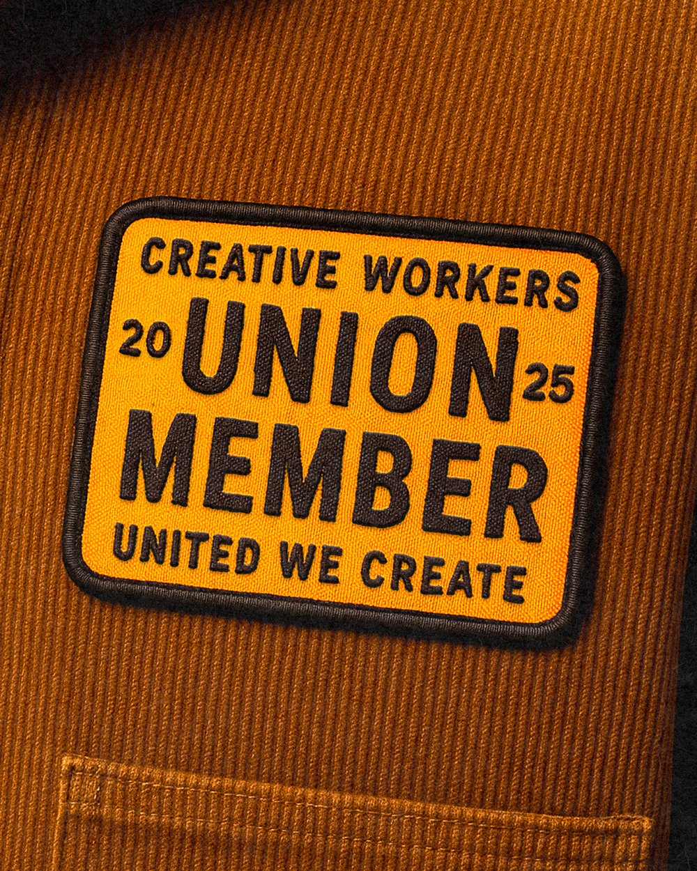
UNITED WE CREATE
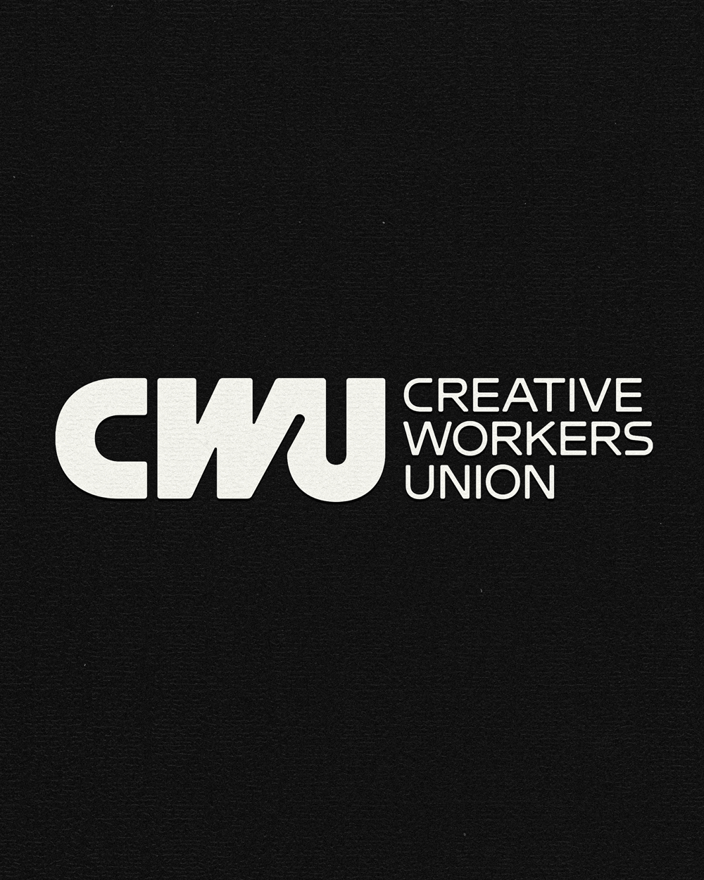
Creative Workers Union

WHAT WE DID
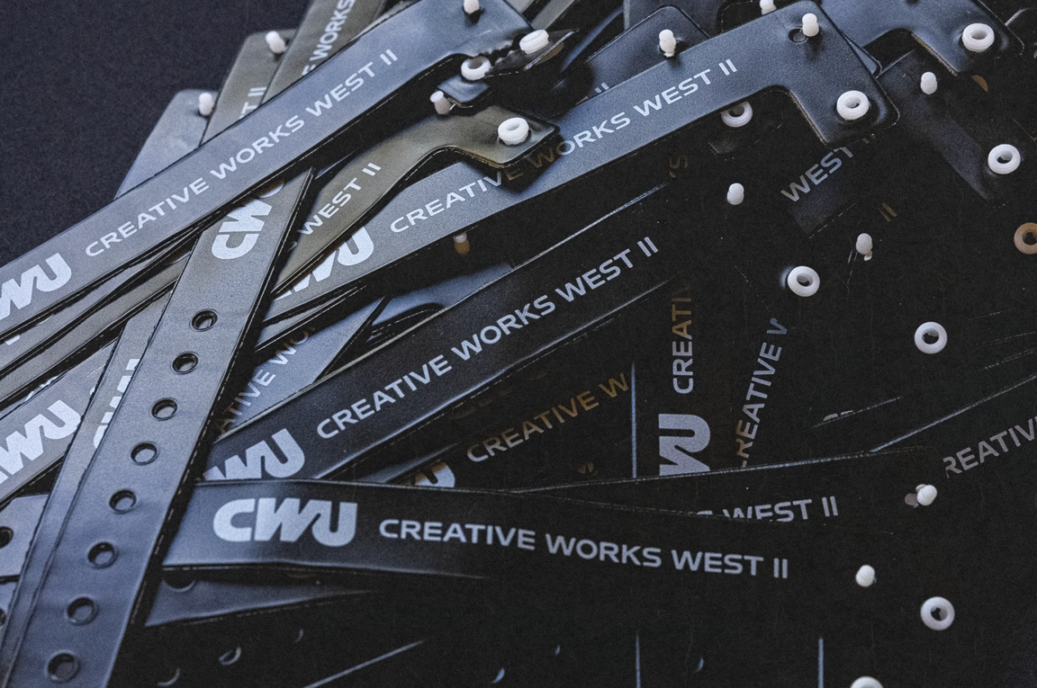
Brand Identity, Campaign, Copywriting, Merchandise, Motion Design and Title Card Design
-
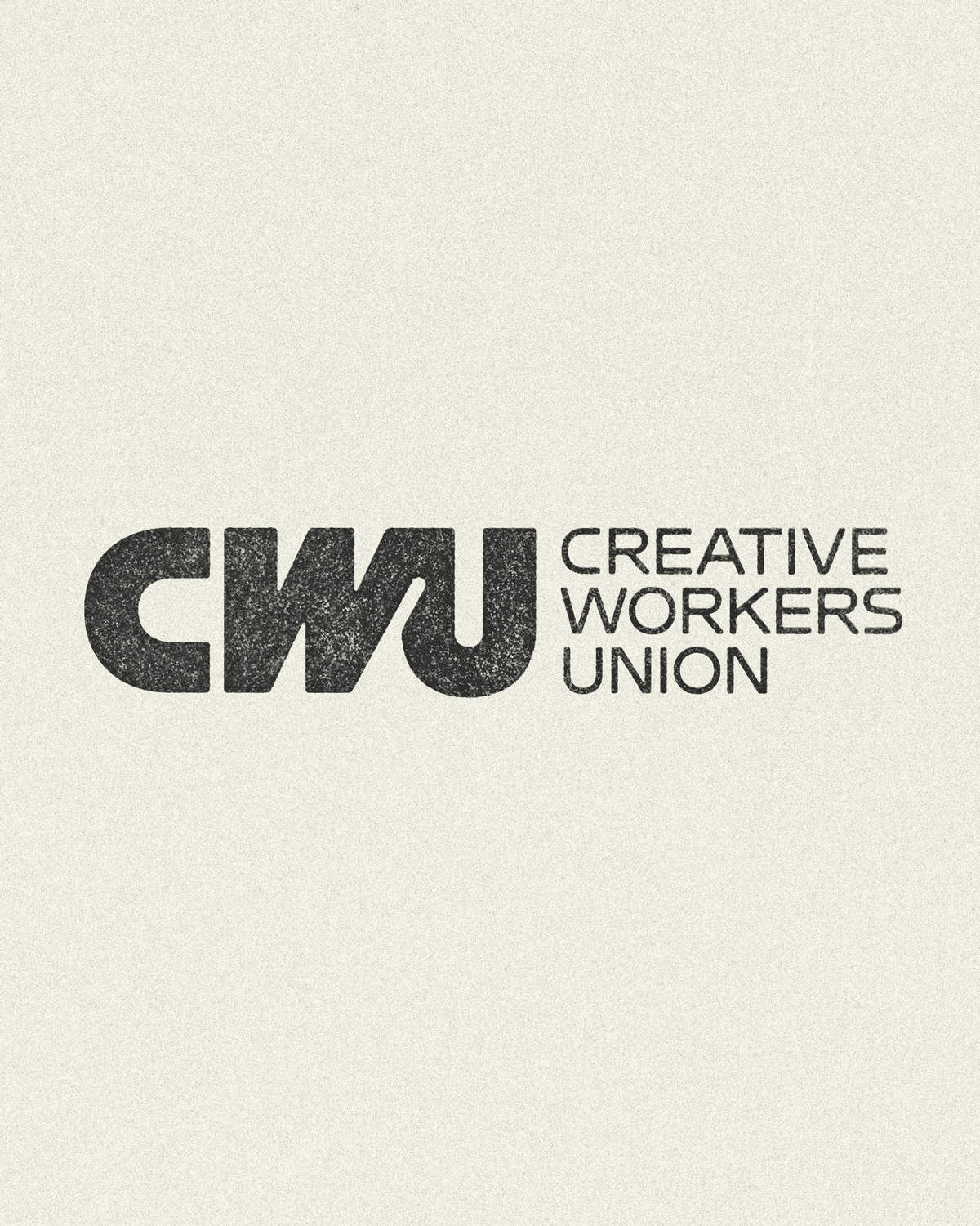
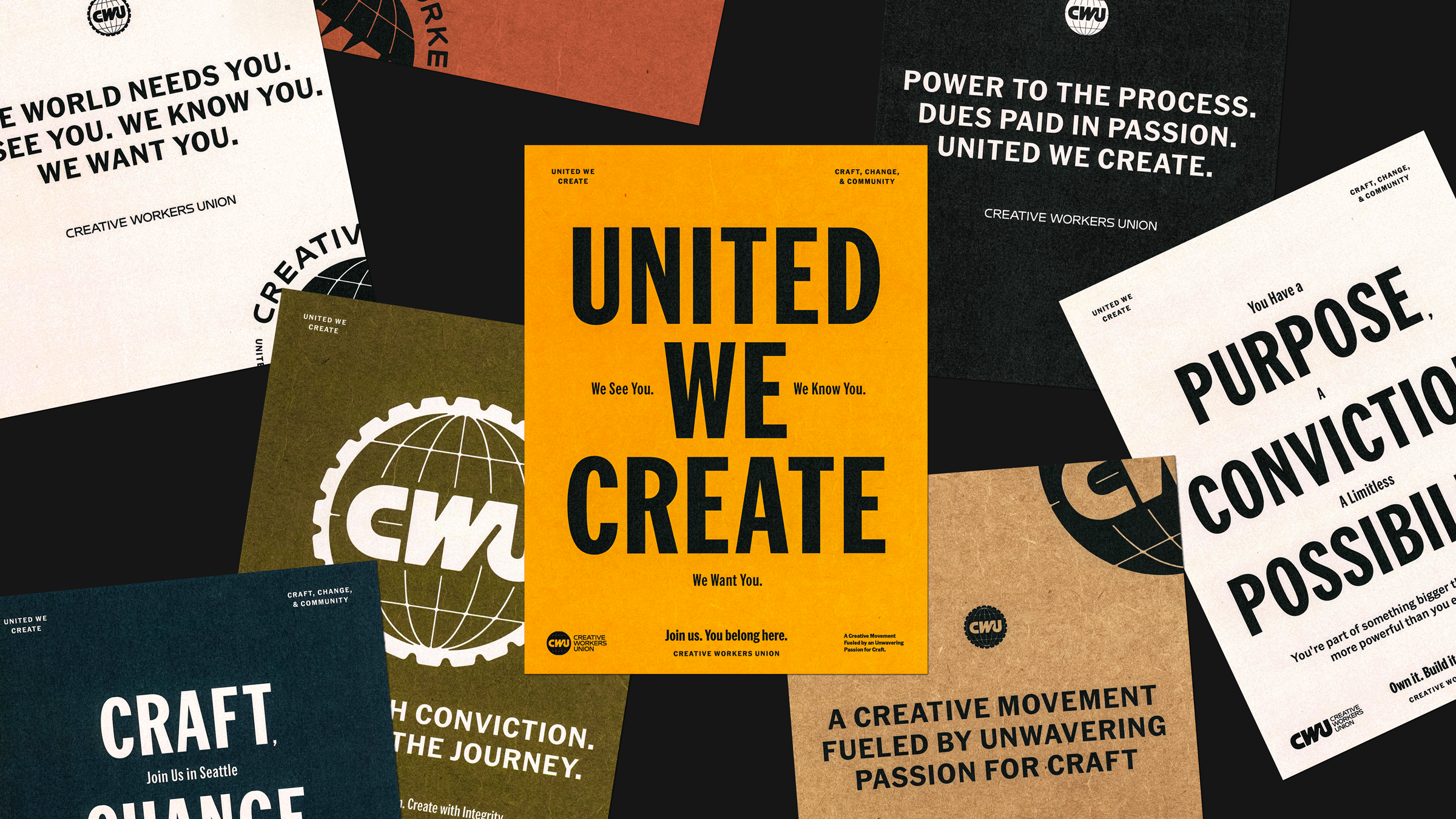
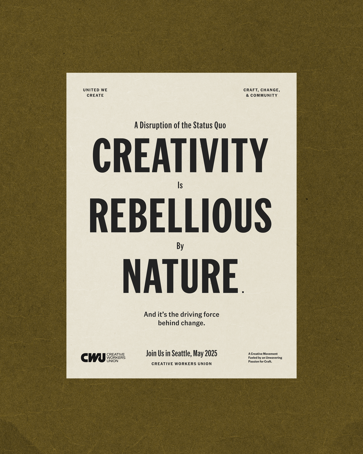
Power to the process. Dues paid in passion.
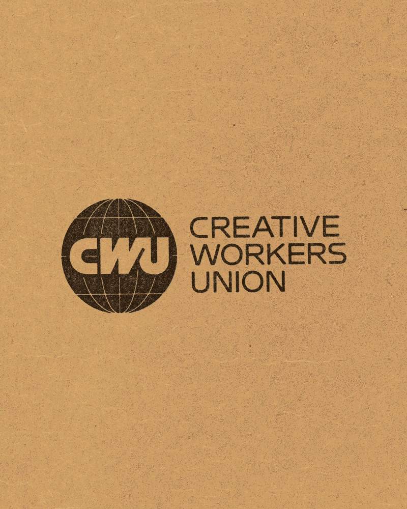
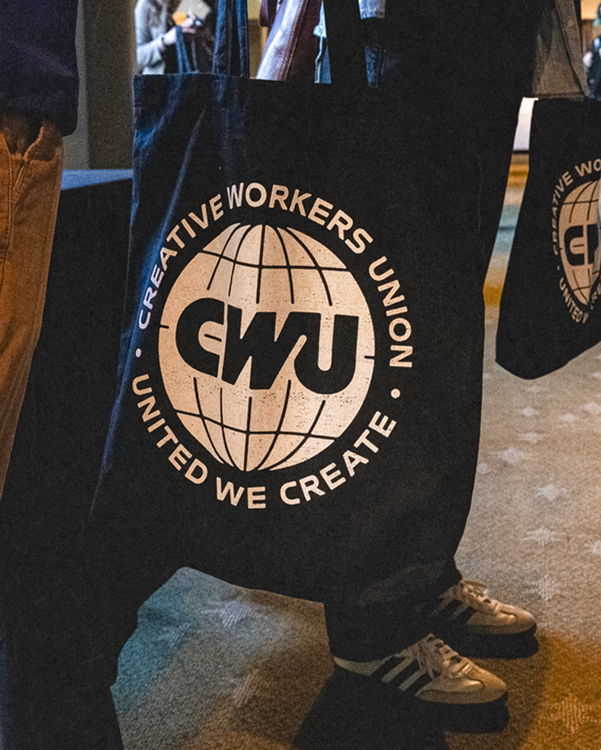
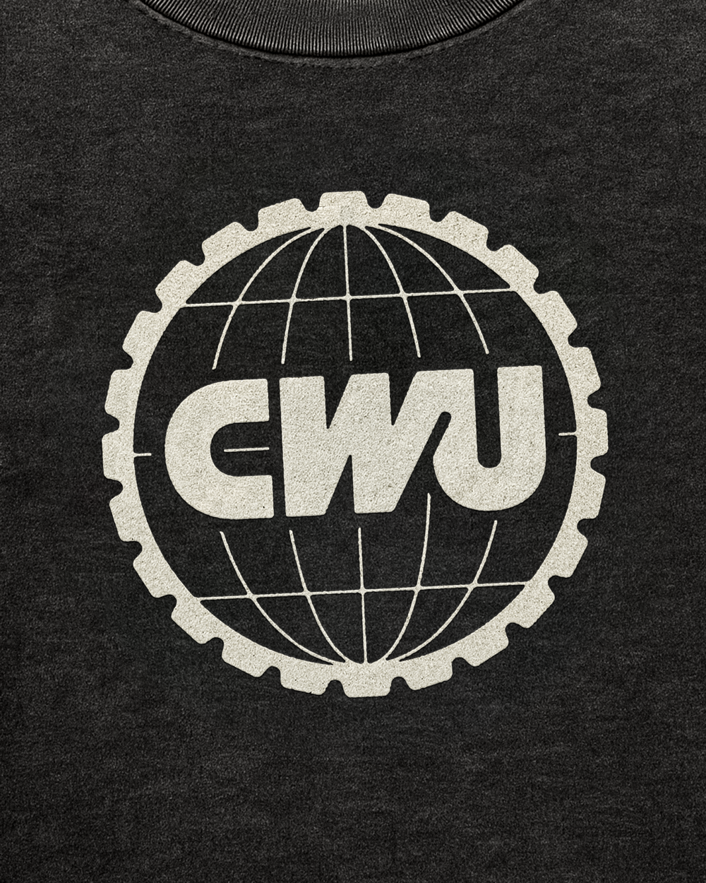
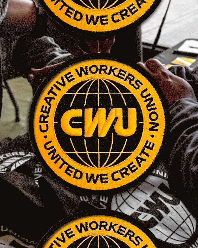
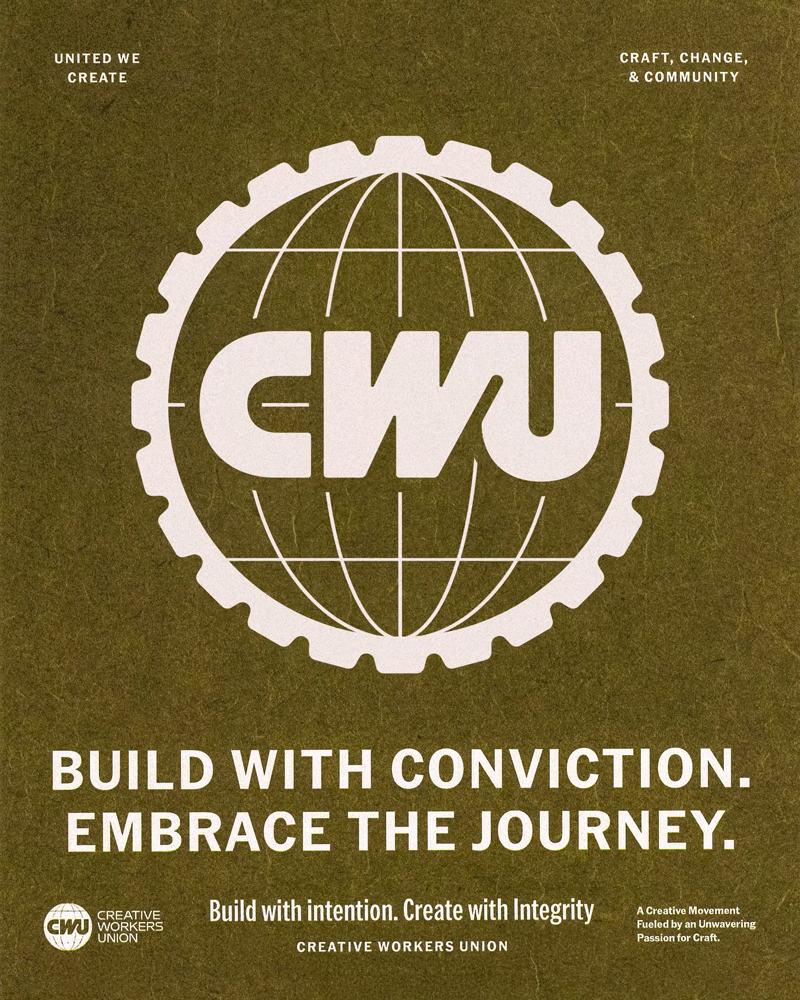
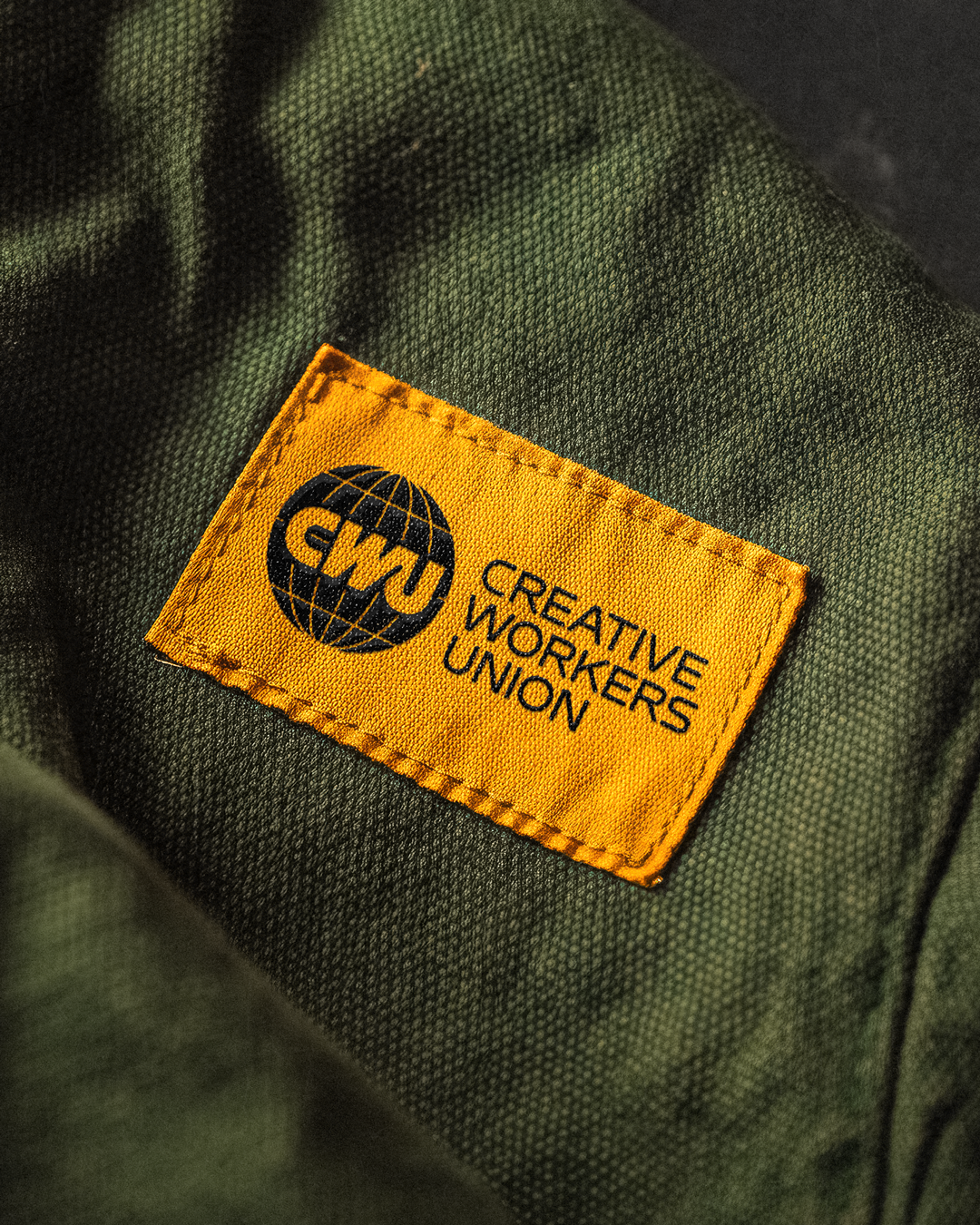
A gear for the workers and a globe for the world they shape. Durham partnered with Josh Horton of Creative Works to build the new look for the Creative Workers Union—a movement that honors and celebrates craft, change, and community.
Creative Works had long been a successful industry event, but as CWU emerged as an extension of the conference, it was clear the identity needed to evolve. The introduction of the globe symbol marked a shift—an open invitation to a global community, and a sign the movement was becoming something bigger. To match that growth, Durham crafted a look and feel rooted in authenticity and adaptability: industrial, utilitarian, and inspired by both labor unions and classic record labels. With artists and designers at the heart of each gathering—on stage, in workshops, and behind the scenes—it was essential the identity made space for their voices and craft to lead.
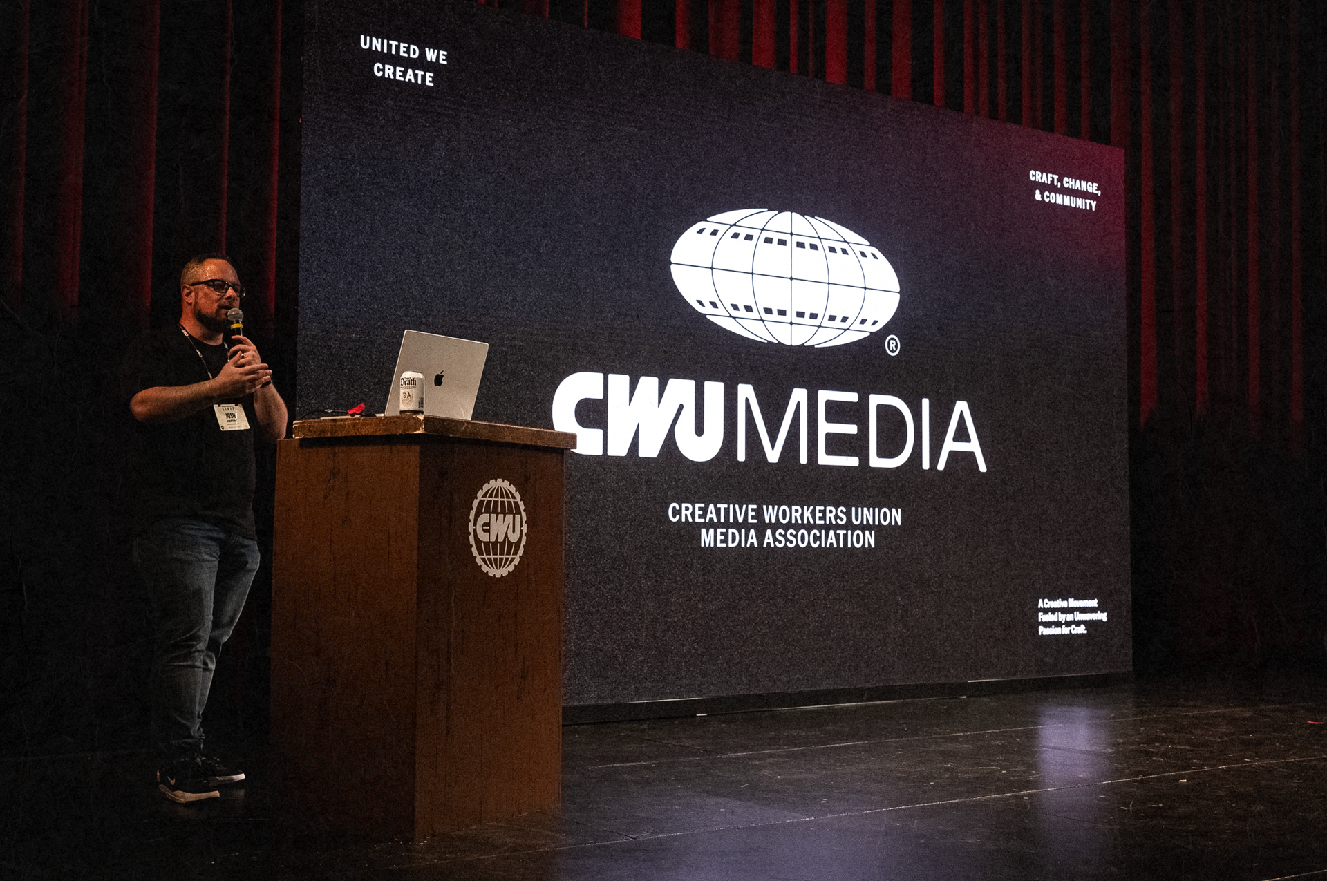
What began as the event identity for the Creative Works West conference in Seattle, now carries the full voice of Creative Works: a new chapter for the collective filled with media, meetups, memberships, merch, and more.
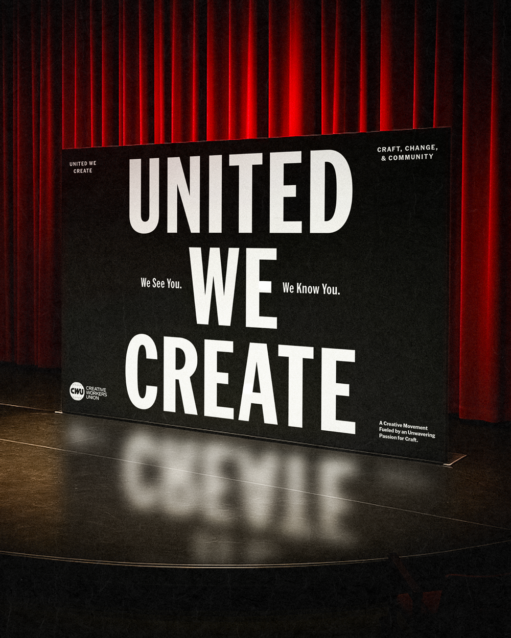
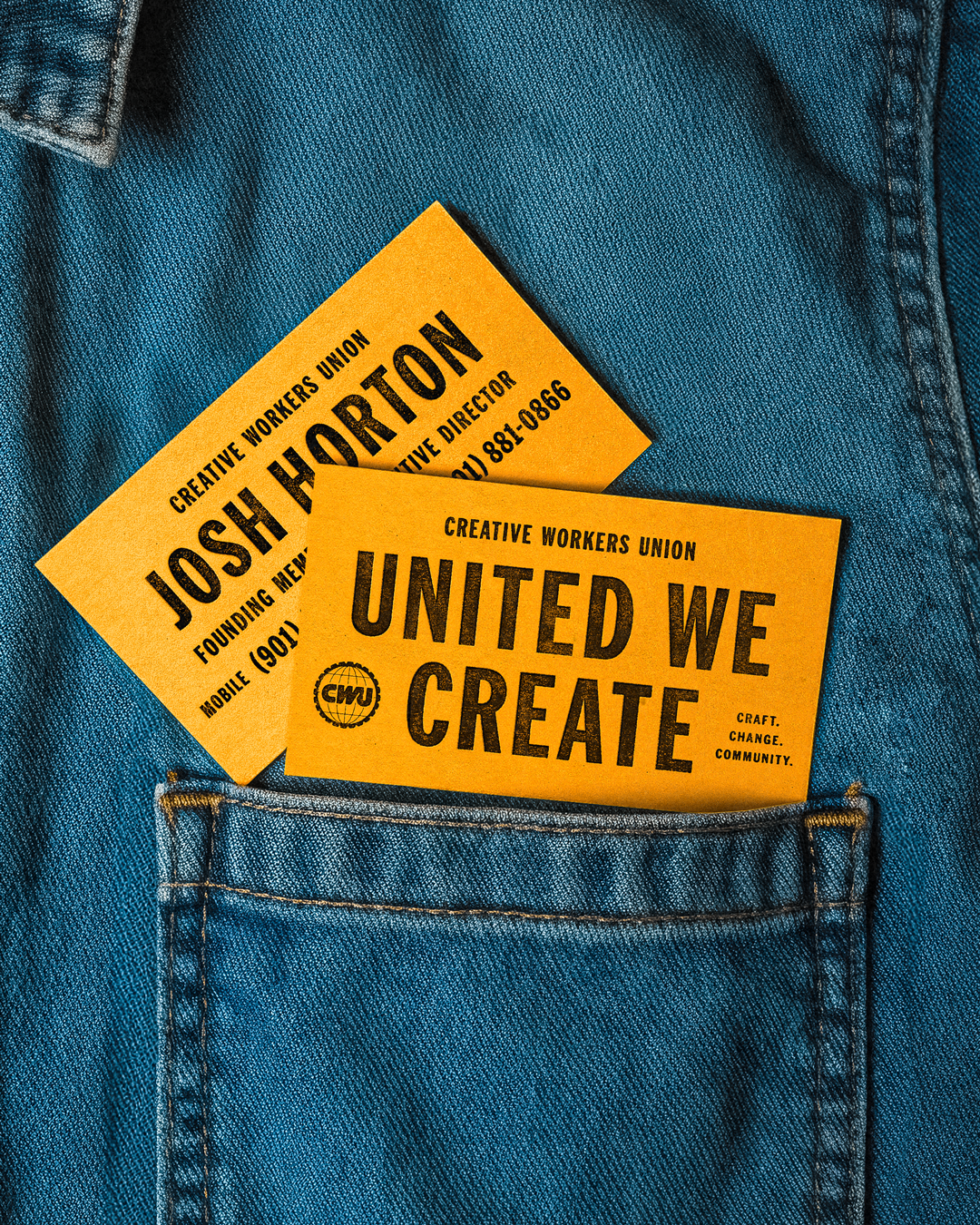
United We Create.
Conference photography courtesy of Creative Works.

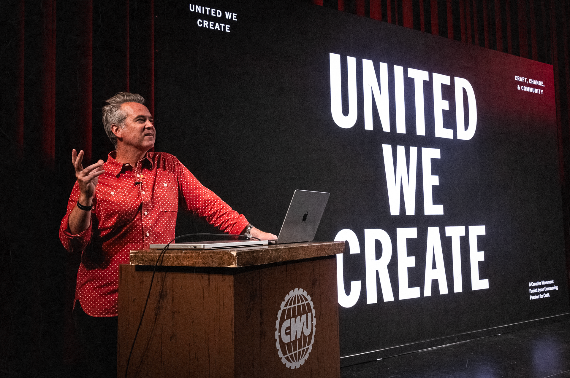
CRAFT, CHANGE, & COMMUNITY
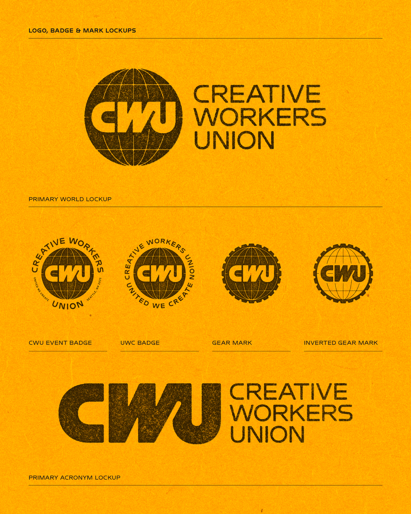
A gear for the workers. A globe for the world they shape.
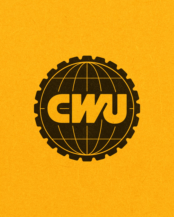
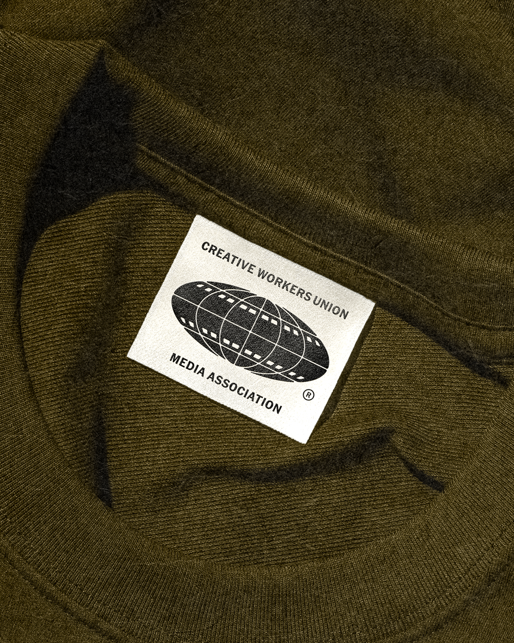
The logo suite for Creative Workers Union builds on the existing gear mark from Creative Works, while introducing a globe—a symbol of openness and invitation to a global creative community. A full kit of variations and lockups was developed to ensure versatility across a wide range of touchpoints. Inspired by the bold simplicity of black ink and the legacy of vintage record label logos, the marks feel both fresh and timeless—rooted in history, but made for today.

UNITED WE CREATE
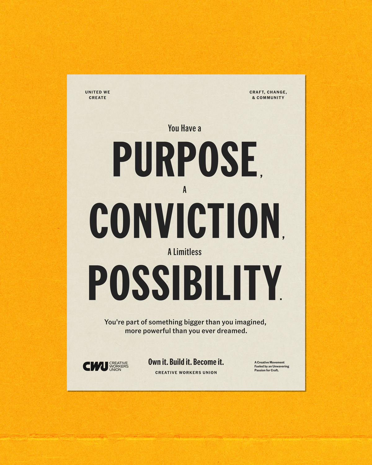
Acknowledging the labor union posters of old, the typographic system for CWU was designed around the simple, yet bold arrangements found within.


UNDER THE BANNER OF CREATIVE WORKS
CWU Media was designed to feel visually aligned with the core Union identity, while functioning as a distinct extension for broadcast and digital content. With its primary use across test patterns, animations, and widescreen formats, the mark introduces a widened globe motif embedded with subtle film-strip references — a visual signal that this is the media-making engine of the movement.


PULL UP A CHAIR AND LET’S CHAT, SHALL WE?